
Creating standout podcast content is just half the battle—getting people to click is the other. In this guide, we’ll break down exactly how to design podcast thumbnails that not only grab attention but also convert casual browsers into loyal listeners.

You’ve got stellar guests, top-notch content and impeccable production quality—but your podcast isn’t attracting the audience it deserves despite the best podcast marketing strategies.
Sound familiar? The missing piece might just be your podcast thumbnail design.
In today’s crowded podcast landscape, your thumbnail is more than just a decorative square; it’s your show’s first impression. With thousands of podcasts vying for attention, that tiny image can be the deciding factor between a potential listener hitting play—or scrolling right past. Whether someone is browsing their favourite genre or discovering new shows through search, your podcast cover art is the very first thing they’ll see. And if it doesn’t stand out, they’ll never get to hear how brilliant your content truly is.
At CrazyTok Media, we’ve seen firsthand how much of a difference a well-designed thumbnail can make to boost podcast visibility. It’s not just about looking good; it’s about grabbing attention, sparking curiosity and ultimately increasing your podcast listens. Whether you’re launching a new show or trying to grow your existing audience, nailing your podcast artwork is essential.
Let’s look at five actionable tips to help you create compelling, click-worthy podcast thumbnails that will stop potential listeners in their tracks.
Table of Contents
5 Top Tips to Create The Best Podcast Thumbnails
Designing the perfect podcast thumbnail isn’t just about aesthetics—it’s about strategy. From using bold visuals to crafting curiosity-driven text, each element plays a role in designing engaging podcast thumbnails and drawing listeners in.
These best practices for podcast thumbnails will help you optimise your show’s cover art to boost visibility, attract clicks and grow your audience.
1. Use High-Quality Images (Seriously, No Blurry Stuff)
You’d think it’s a no-brainer, but plenty of podcasts still feature pixelated, poorly cropped images. Blurry thumbnails don’t just look unprofessional—they practically shout ‘amateur’.
No matter how expert your content is, a low-res image sends the wrong message. In today’s image-driven world, listeners will judge your podcast by its cover. A sharp, high-quality thumbnail instantly signals professionalism and hints at the value-packed content waiting inside.
If you’re hosting a guest, don’t just settle for the first headshot they send over. Ask for multiple high-quality photos with different expressions and angles. This gives you more flexibility to pick an image that fits seamlessly with your design, ensuring your podcast cover looks polished and cohesive.
And if you’re the face of your own podcast? Investing in a professional photoshoot is one of the best decisions you’ll make—it pays off every time someone scrolls past your show.
Pro Tip: Use high-resolution, licensed stock photos from trusted sites, or tap into design platforms like Canva, which offers a treasure trove of professional images included in their pricing. Canva’s easy-to-use tools help you tweak image quality to perfection, making sure your cover art always looks crisp and eye-catching.
Even better, feature people in your thumbnails. Human faces—especially with warm, inviting expressions—naturally draw the eye and create an instant emotional connection. Research consistently shows that images with faces increase engagement on visual platforms, and the same holds true for podcasts. A smiling, approachable guest can make your show more relatable and enticing to potential listeners.
We integrate high-resolution images of the host and guests in almost all the thumbnails we design, and this method works well for our clients.
2. Bright, Bold and Beautiful: Play with Complementary Colours
Muted, dull tones might have their place in minimalist art galleries, but when it comes to podcast thumbnails, they’ll only cause your show to fade into the background.
Colour schemes are foremost among all podcast thumbnail design tips. In a sea of vibrant, eye-catching designs, your thumbnail needs to pop off the screen to grab potential listeners’ attention. Bright, complementary and contrasting colours aren’t just aesthetically pleasing—they’re essential for making your podcast stand out.
When people scroll through podcast platforms, they’re often moving quickly. Bold colours act as visual anchors, catching the eye before someone even registers the content. This quick flash of colour can be the difference between a listener pausing to check out your episode or scrolling right past it.
Not sure where to start with colour combinations? Design platforms like Canva offer built-in colour palettes that are not only visually appealing but also perfect for maintaining a cohesive brand across episodes. If you want to explore beyond that, online tools like Coolors can help you generate harmonious colour schemes tailored to your podcast’s vibe.
Consider what we have done here for one of our clients’ shows with a striking color palette and a very minimalist design overall.
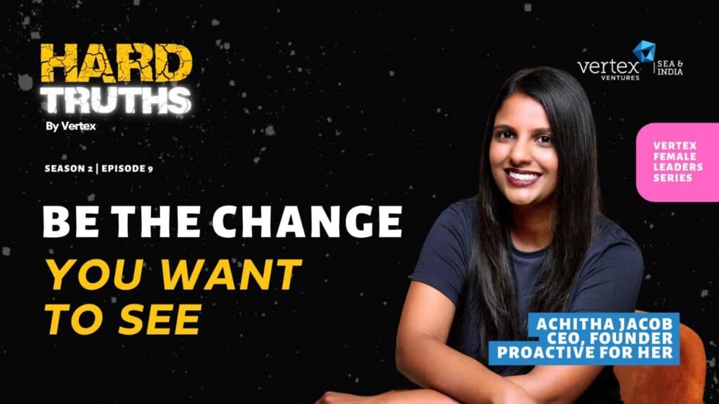
Pro Tip: Stick to two or three bold colours that contrast well. This simple strategy makes your design pop without overwhelming the viewer and ensures that any text on your thumbnail remains clear and easy to read. A well-chosen colour scheme not only grabs attention but also subtly reinforces your podcast’s identity—making it more memorable to both new and returning listeners.
Bonus Insight: Research has shown that colour psychology plays a significant role in audience engagement. Warm colours like red and orange can evoke excitement and urgency, while cool tones like blue and green create a sense of trust and calm. Understanding how colours influence mood can help you design thumbnails that resonate emotionally with your target audience, increasing the likelihood of clicks and listens.
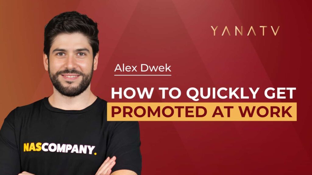
3. Keep Your Text Simple, Bold and Eye-Catching
People are scrolling through their favourite platforms at lightning speed, and you have a fraction of a second to grab their attention. Also, your thumbnail is going to be tiny on most devices. If your text is too long, too small, or written in a fancy script, it’ll get lost in the shuffle.
Keep it simple, bold, and to the point. Aim for no more than 3–5 words that are punchy and intriguing. Think of your thumbnail as a teaser, not a full explanation of your episode.
Font choice matters, too. Stick to clean, sans-serif fonts that are easy to read at a glance. Avoid script or overly decorative fonts—they might look stylish up close but become illegible when scaled down to thumbnail size.
We have actioned all these tips in the above thumbnail we designed, saying everything that needs to be told with standout text.
Pro Tip: Make sure your text contrasts sharply with the background. A bright font on a dark background (or vice versa) makes your message pop and ensures it’s easy to read on both small screens and larger displays.
4. Add Arrows, Frames or Visual Elements for Extra Punch
Want your podcast thumbnail to stand out in a crowded feed? Take a cue from successful YouTubers who master the art of grabbing attention with simple, strategic design elements.
Research shows that thumbnails with clear visual cues can significantly boost podcast click-through rates on YouTube as well as other podcast platforms. By directing attention to the most compelling aspects of your content, you’re more likely to engage potential listeners and entice them to hit play.
Adding arrows, frames or objects to your thumbnail can subtly guide the viewer’s eye to key details—whether it’s your guest’s face, an intriguing phrase or your podcast logo. These visual cues help create a focal point, making your thumbnail more dynamic and click-worthy.
While YouTubers have the luxury of larger, rectangular thumbnails, podcast thumbnails are smaller and square, which means every design choice counts. Precision is key. A bold arrow pointing towards an intriguing phrase, a frame around a guest’s face to highlight their importance or a question mark to spark curiosity can make all the difference in catching someone’s eye as they scroll.

Pro Tip: Less is more. Overloading your thumbnail with too many elements can make it look cluttered and overwhelming. The goal is to enhance—not distract from—the core message, which is what we have tried to accomplish in the above example.
You can also try tools like Canva to experiment with subtle additions that highlight key features while keeping the overall design clean and professional.
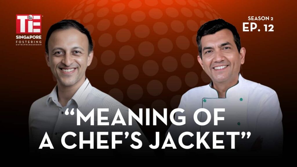
5. Craft Curiosity-Inducing Text (Not Just Your Episode Title!)
This is the hardest—but most impactful—tip when designing podcast thumbnails. Most podcasters fall into the trap of simply slapping their episode title onto the thumbnail and calling it a day. But let’s be honest—something like “Interview with John Smith on Leadership” isn’t exactly stopping anyone mid-scroll.
Instead, your thumbnail needs to tease the content in a way that sparks curiosity. Think of it like writing a headline for a viral article: it should hint at the value inside without giving everything away. The goal is to make potential listeners think, “I need to hear this!”
For example, rather than “The Future of Work with Jane Doe”, imagine seeing “Why Your Job Won’t Exist in 5 Years” on a thumbnail. See the difference? The latter grabs attention, stirs intrigue and practically demands a click.
In this thumbnail, for instance, our intention was aligned perfectly with the client’s: To say as little as possible, stoke up the curiosity element and see more click-throughs.

Pro Tip: Pairing a strong, not-so-straightforward hook with a clean, simple design will always outperform even the most beautifully designed thumbnail with a bland title. People are naturally curious—it’s human nature. Tap into that curiosity, and you’ll find your click-through rates soaring.
Bonus: Keep your hook short—ideally five to six words—and make sure it aligns with your episode content. You want to entice clicks but avoid crossing into clickbait territory. A compelling, honest hook builds trust with your audience, keeping them coming back for more.
Wrapping Up
Your podcast thumbnail isn’t just a visual—it’s a tool to attract clicks and grow your audience. By following these five actionable tips, you can transform your podcast’s visual appeal and ensure your content gets the attention it deserves.
Here’s a quick recap of the key takeaways:
- Use high-quality images. Opt for high-resolution, licensed photos and feature human faces to create an emotional connection.
- Leverage bright, complementary colours. Make your artwork pop with bold, contrasting colours that stand out in crowded feeds.
- Keep text simple and bold. Use clear, easy-to-read fonts with short, punchy wording. Ensure strong contrast between text and background.
- Incorporate arrows, frames or objects. Use subtle design elements to guide the viewer’s eye and highlight important parts of your thumbnail.
- Craft a curiosity-driven hook. Replace boring episode titles with intriguing, click-worthy phrases that pique interest and invite exploration
At CrazyTok Media, we know that great content deserves great design. From podcast production to branding and marketing strategies, we help creators like you craft every element of your podcast to perfection—including those all-important thumbnails.
Remember, your thumbnail might be small—but its impact is huge. Ready to take your podcast to the next level? Get in touch with us today, and let’s make every pixel count!